How to display a customized time ruler using line chart
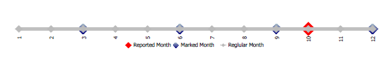
The requirement is to generate image below using line chart. For the sake of explanation, the business logic to mark month and report month is ignored here. Please download report specification for detail review
To generate this report, there are two key points:
- Make line chart show as line
- Make each measures as separated line
Implementation steps:
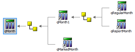
- Get query data ready
The data looks like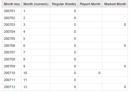
- Define line chart with three series, regular, reported and marked month

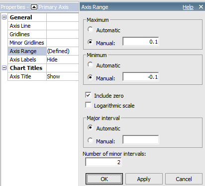
- Define line primary axis range as small as possible, hide most of chart properties
No comments:
Post a Comment