It is intended to demonstrate thre usages:
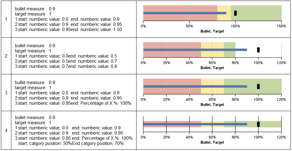
- The maximum percentage is dynamically determined based on two measures: bullet measure and target measure. It will use large one and then extend it in some degree. However, you can fix its value as well.
- To let color to cover right side, you can specify end number value as 100%. In this case, the color covers whole axis, which make report looks nice.
- Furthermore, you can change color range in vertical position as well in case when needed.
I am William..I just browsing through some blogs and came across yours! Excellent blog, good to see someone actually uses for quality posts.Your site kept me on for a few minutes unlike the rest :)Keep up the good work!Thanks for sharing a important information on cognos
ReplyDeleteHey Charles,
ReplyDeleteThanks for these blog posts. Very helpful. I am trying to work with bullet charts, connecting them to a Dimensional Model. I am setting the graph up to use Actual Dollars as my Bullet Measure, Budget Dollars as my Target, and Budget as Default. I, then, am using my 'All Divisions' member as my Category and my individual division members as my Series, so that they will all stack one on top of the other. Now, I would like to have a varying Colored Range behind each bullet bar that is green when within 1,000,000 of the budget, yellow within 2,000,000, and the rest red. I am able to do one bar with 4 Query Calculations (BudYellowLow, BudGreenLow, BudGreenHigh, and BudGreenHigh) that look similar to
total([BudAmt] for [div1Member]) + N (or - N depending)
but, as you can see, this does not change the Colored Range when moving to the next division within the series.
Is there any way to dynamically change the colored range based on what series is graphed or do I need to create a new graph for wach division?
regards,
Did you ever get an answer to this? I too would like to know how to have different colored regions for each member of a series.
DeleteHi,
ReplyDeleteTonight I am working on a Bullet Chart, however, I found what I take as an issue with it. If your Bullet Measure is higher then your Target, such as a actual sales higher then target or Goal data then the Bullet Measure line does not appear on the chart. we are currently on version 10.2.1. Do not have an example of that kind of dataset, but be interested if you try that and let me know the result. Best Regards Charlie Palmer
ReplyDeleteThat is nice article from you , this is informative stuff . Hope more articles from you . I also want to share some information about cognos tm1 training and tomcat tutorial
ReplyDeleteThat is nice article from you , this is informative stuff . Hope more articles from you . I also want to share some information about ibm cognos tutorials and cognos training