Context
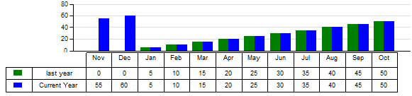
It happened many times during my consulting that table are needed aligned with Chart (see below)
Such a requirement is normally from mockup from business users using excel spreadsheet. It is easy for excel, but difficult for both SSRS and Cognos. There are two impressive studies for SSRS and Cognos:
- SSRS Charts with Data Tables (Excel Style) (http://www.sqljason.com/2012/10/ssrs-charts-with-data-tables-excel-style.html)
- The Cognos Report Toolkit - Align series data with axis categories in chart (http://cognosknowhow.blogspot.ca/2013/04/the-cognos-report-toolkit-align-series.html)
However, both solutions have some limitations. This document shares a new idea to resolve this issue in an easy way, but still with perfect alignment. The limitation for this solution is that the number of categories (or columns) is static.
Solution overview
The goal is figure out a way to determine two parameters:
- The width of each column in table
- The start position of table
I have achieved this goal by creating a spreadsheet, where you can input data and then derive two parameters mentioned above.
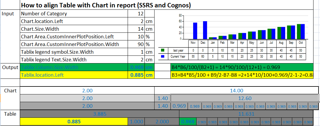
You can download this spreadsheet for detail reference; it will save a big time. (a new version of spreadsheet with area chart is attached here as well)
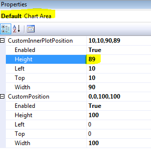
Column Width = (Chart.Size.Width) * (Chart Area.CustomInnerPlotPosition.Width) /100
/(( Number of Category)+1)
Tablix.location.Left
= (Chart.location.Left)
+(Chart.Size.Width)*(Chart Area.CustomInnerPlotPosition.Width)/100
+ (Tablix Column.Size.Width)/2
-(Tablix legend symbol.Size.Width)
- (Tablix legend Text.Size.Width)
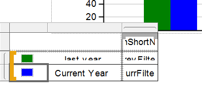
Note to add Symbol
There is no way that we can add legend in table as excel. What we do is to define color in chart and make color in table. Steps
- Define color in chart;
- Add a legend symbol column;
- Drag rectangle into column;
- Drag a small rectangle with corresponding color into existing rectangle.
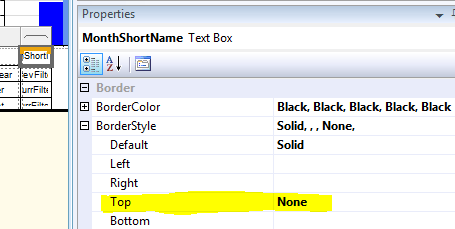
Note to Show horizontal axis
- Even we don’t need to show title, we need to make sure that we show horizontal Axis. As we need to have that horizontal line
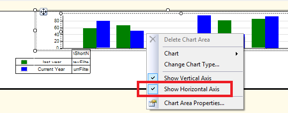
- Level 1% of height to chart boundary, so that line will be displayed while text will be hidden
- Hide the top line of tablix
No comments:
Post a Comment