Requirement
Below is chart with series data that is fully aligned with columns in chart. Please note that table below the chart is not generated by separated query. Chart and graph share the same query, therefore results in a very good performance.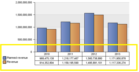
Query
The idea is to have a query with three columns that are considered as categories, such as year, quarter and month. In this case you want to have all three categories as the same.
(DMR and Cube Queries are similar)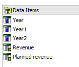
Year: [Sales (query)].[Time].[Year]
Year1: [Sales (query)].[Time].[Year]
Year2: [Sales (query)].[Time].[Year]
Revenue: [Sales (query)].[Sales].[Revenue]
Planned revenue: [Sales (query)].[Sales].[Planned revenue]
The query result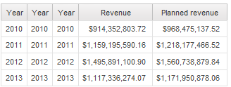
Layout
Step 1: Create normal chart as below, sorted by year
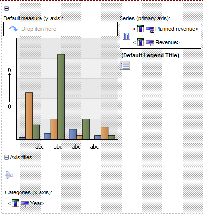
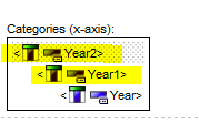
Step 2: Drag Year1 and Year 2 as parent for Year
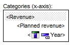
Step 3: Change Year 1 and Year 2 from member caption to date item Label to Revenue and Planned Revenue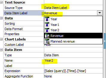
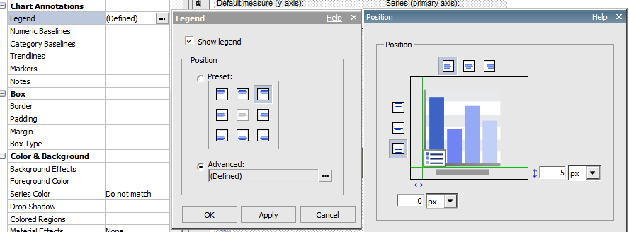
Step 4: customize legend position, and make it aligned with categories
what version of cognos does support above functionality ?
ReplyDeletethis sample is built based on version 10.1.1
ReplyDeleteSimple yet powerful. Using 10.2.2 here.
ReplyDelete